Wednesday 9 May 2018

General Data Protection Regulation (GDPR)


The new regulation in EU law on data protection and privacy will come into force on 25th May 2018.


You may be aware of the changes involved through the recent Facebook Cambridge Analytica scandal and the updates Facebook are making to comply with the new EU law.  In the UK, the regulation replaces the previous 1995 data protection directive, since then the digital world has boomed and the European Parliament have introduced the update to match our ever improving modern technology. In real terms, the regulation determines how our data can be gathered, used, and destroyed at request. Everything from your smart watch to your employer collects data on you and the regulation has been created to protect people from that data being used without your permission or getting into the wrong hands. Digital searchable data falls under the “right to erasure” or what is commonly called the right to be forgotten, but even paper documents must be labelled and filed accurately so that a person can request all data on them to be securely destroyed unless it’s required to be kept by law, such as for banks or for archiving purposes such as historical and scientific data.

Whilst the regulation primarily focuses on digital data, physical paper documents require equal amounts of protection and security to prevent a data breach. Only staff who work with the data should be able to see or have access and all files should be kept in secure lockable units or filing cabinets. Communicating the changes to staff is important so they understand their accountability and rights to access certain data.

Data on the move is another area which requires additional attention, an unsecured USB drive, backup CD or even paper files can be easily left on desks, fall out of bags or pockets or generally misplaced. It is vital that all documents that fall under the regulation are looked after with care and attention to ensure their safety.

Data requests between companies must also be treated with care and confidentiality. If data is sent about an individual, the person must first be asked permission for their data to be shared, then the receiving party must explain why they want the information, what it will be used for and the measures they will take to protect then destroy it.

Any company that fails to comply with the new regulation can be fined up to €20 million or 4% of the total worldwide annual turnover depending on the nature and gravity of the infringement. For any business, big or small, the fine could be devastating.

Here at Scott Anson we already have strong data protection for both our operatives and clients, however to comply with the new legislation we’ve implemented a few small changes to our policies and procedures so that we have confidence in all data being safe and secure.

Understanding the Colour Wheel in Painting and Decorating

When it comes to decorating and interior design, using the colour wheel can help you in understanding colour schemes and how to use them in your home or office.

Primary colours: Red Yellow and Blue, the base colours from which all other colours are made from.
Secondary colours: Orange, Violet and Green. These are the colours made by mixing the primary colours.
Tertiary colours: These are the colours made by mixing two of the previous colours, either a primary and a secondary colour, or two secondary colours. 

To decide on the colour for the space first think about the look you want to achieve, is it to be a cosy relaxing room, an inspiring work space or a romantic boudoir. If you’re wanting to keep current accessories or furnishings, then have a look at the key colours they contain as your starting point.

Harmonious colour schemes use colours that sit next to each other on the colour wheel, so if you have a red sofa you could look at working with orange and yellow or violet and magenta.
Monochromatic colour schemes use the same colour in different shades and hues. To match that red sofa you may want to try a salmon red feature wall and accessorise with dark red cushions.
Complimentary colours are those which sit opposite each other on the colour wheel, for decorating it can provide interesting uses of colour to add depth to a room. Match that red sofa with a pale mint green or rustic vintage green wall and dark green and white stripe cushions.
Contrasting colours are two colours from different segments of the colour wheel. You won’t find them in interior design very often as they can be quite uncomfortable to look at. The best example of how uncomfortable these colours can be is the Chromostereopsis effect using bright red and royal blue. On 2D flat images red appears to be closer and blue further away which causes a “flashing” effect as your eyes struggle to understand what they are looking at. You more than likely wont want your walls painting in red and blue stripes unless you want any visitors to feel that visual discomfort.

If you’re having difficulty trying to match colours then most paint companies have guides on their websites. Dulux lets you start with your main colour choice, asks which room and surface it’s for then shows you the palate you can work with, they even have their own app called the Dulux Visualizer where you can try colours on your room through the app. Crown let you view their paints by colour section and Farrow and Ball even offer a colour consultancy service if you’re really struggling. If wallpaper is more your style then Graham and Brown also let you view the wallpaper by colour scheme.


Colour psychology

It can be useful to understand the basics of colour psychology and the most appropriate colours you could use for the space depending on how it will be used.

  • Red – Is known for increasing appetite, you’ll find many restaurants use red colour schemes for this reason. It can be associated with danger so may be used to accent danger points in offices, it’s also associated with passion so can be a popular choice for bedrooms however it can be a little overwhelming so try to use sparingly. Pink shades of red have a more aesthetically pleasing and soothing effect.
  • Blue – Dark blue is known for decreasing appetite; some people use blue kitchen ware to help them eat less. Light blue is a cooling calm colour making it a great choice for summer houses or conservatory’s. It’s also been shown to improve concentration and stimulate thinking making it a good colour for study space or offices, keeping people calm yet also promoting productivity.
  • Yellow – The joy of sunshine is passed through the colour of yellow, it’s a bright, positive, fun and optimistic colour. Use it as a highlighting colour or for a bright welcoming lounge or hallway to start and end your day in a good mood, however too much yellow can cause heightened tempers and tantrums so limit the use in rooms you spend a lot of time in.
  • Green – The colour of nature, growth and balance. The right shade of green can create a relaxed laid back feeling like being out in the countryside, however a murky dirty green can make people uneasy and promote negative energy. A natural green colour scheme would turn a living room or bedroom into a relaxing retreat.
  • Orange – Believed to aid digestion, lung function and increase energy levels. It can promote invigorating excitement and enthusiasm so would make a great colour for a gym or workout space. Accessorise with orange for areas and objects you use on a daily basis to encourage the positive psychological results. For people who are already bold and confident orange can bring out arrogance and flamboyant tendencies. Use in larger rooms with plenty of light as orange can make a room look smaller.
  • Purple – Lighter purples and lilacs can bring a similar calming quality to blues but without feeling as cold, a bright purple is associated with creativity, luxury and royalty however dark purple can evoke sadness and frustration.
  • Black – A dramatic colour that absorbs all light and reflects very little back. It’s associated with death and depression however black can be used to soften vivid bright colours with patterns or accents. If used sparingly it can transform a room and look very modern and sophisticated.
  • White – Often white is just used as a neutral base colour before a tenant personalises the space, however it can be used by choice to make the most of natural light and create a serene environment. It can however risk looking clinical and sterile so if you prefer white walls then accent areas with a little colour or pattern to break up the potential starkness of the white.
  • Ceilings - For ceilings, a colour lighter than the walls will make the ceiling appear higher, where a darker ceiling will make it feel lower and smaller, although this can be used to create a cosy feeling.

A post shared by Dulux (@duluxuk) on


Wednesday 2 May 2018

Garden and Exterior Decorating for Summer

This week is national gardening week, we’re well into Spring and fast heading towards Summer. With the bank holiday coming up now is the time to spruce up your garden space and make it somewhere you can relax over the warmer months and into the cosy evenings.

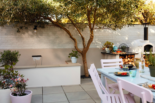
Keep it traditional with neutral wood shades or be a little brave and add in some splashes of colour. A freshly painted fence, railings or door can create a beautiful backdrop for your gardening projects as the flowers are all starting to bloom and the tree’s shine green once again. Pastel shades work well with the British sunlight and can make a space glow, don’t be afraid of painting a bench, fences or plant pots and pebbles in a light pastel blue or pale yellow. The daylight can also mean you can get away with some darker shades that you wouldn’t use inside as there’s more light, use accents of darker colours to compliment the pastel shades or be even more daring and create some custom patterns for a truly unique space.
Dulux recommend the Cuprinol Garden Shades page where you can find an array of design ideas and colours to spark your inspiration. The Cuprinal Youtube account, Dulux Instagram page and Ronseal Youtube are all bursting with tutorials and inspiration to help you imagine how you could transform your garden. From hanging herb planters to a snazzy childrens playhouse the possibilities are endless. Reclaimed wood makes great home made furniture or planters, recycled tiles can breathe new life into old wooden tables and even strips of guttering can be used to create mini window boxes or planters pinned to fencing.

Whether you’re interested in a full al fresco fine dining experience or a traditional party BBQ in the sun, you can make your outdoor eating area whatever you want. Outdoor fabrics can be found in an array of colours and patterns, available from budget high street stores like Aldi and Matalan right up to John Lewis and online stores like NotOnTheHighstreet.com. Placemats, seat covers, blankets and lounge pillows can all be found in outdoor fabrics so pick a few to match your colour scheme making your space as cosy or as invigorating as you desire. Merging the colour scheme from indoor to outdoor can help blend the two spaces together, alternatively you could use contrasting colours to make the outside space pop against its neighbouring interior.

Outdoor lighting for the evening can transform a space yet again, once the glow of the sun has dropped beyond the horizon, outdoor copper fairy lights can set the mood for a romantic evening under the stars, fire pits help get the party roaring or lanterns and candles can create an ethereal bohemian mood. Switch between all three depending on the day, company or occasion.


Tips for painting wood:

  • Prepare the wood. For garden furniture, windows, fascia’s and any other smooth wood the safest way to prepare is to sand off the old paint or varnish, if you’re working with a large area then an electric sander would be quicker and easier. Hot air guns or paint strippers are another option but must be used with great care and attention, don’t turn your lovely garden furniture into a summer bonfire! If the wood has rot the area can be removed and plugged with new wood or cleaned down and treated with fungicidal wash. For fences and wood in good condition a simple pressure wash may be all that is needed to clean down ready to paint. 
  • Seal. Where necessary, such as for sheds and wooden window frames, caulk or putty can be used to create a waterproof seal. Smooth down once applied to create a nice even finish.
  • Wash the wood before painting to remove any remaining dirt or sawdust. Make sure it’s completely dry before painting.
  • Prime. To get the best results from your top coat it’s important to prime the wood. Ideally using the same brand as the top coat. Follow the instructions on drying time before starting on the top coat.
  • Paint. The majority of quality paints will need multiple coats, there are one coat options available for wood but they aren’t recommended if you want the finish to stay fresh for a long time. Make sure the paint is completely dry before applying another coat, this can be helped by leaving it in the sunshine as the UK sun won’t be hot enough to blister and damage the paint, just dry it faster.

Reviving metal garden furniture and decorations:

  • Remove and replace rusted screws and bolts. If they’re hard to get out then WD-40 and a light tap with a hammer should loosen them up.
  • Remove fungus and algae with a fungicidal wash or sterilising solution to kill off the spores. Wear heavy duty gloves and always follow the instructions.
  • Sand down with abrasive sand paper, a steel brush, paint stripper or sanding drill to remove old paint. Wear gloves and a mask as this can cause lots of harmful dust.
  • Clean the item with hot soapy water to remove all dust and grease. Rinse then wipe down with acetone or rubbing alcohol to ensure there’s no residue left on the metal.
  • Fill any rusted holes with epoxy filler, once it’s dry sand down to a smooth finish.
  • Prime. First make sure you have the right paint and primer for the type of metal you wish to paint. Always read paint instructions as a primer may have to match the paint to be used successfully and without any chemical reactions.
  • Paint. Apply the first coat of paint then let it dry completely. Lightly sand the piece down to help the next coat stick. Then apply a 2nd coat. Follow instructions on how long to leave it between coats and how many coats it may need. Spray paint is good for intricate metal work to get into all the small nooks and crannies.


  • A post shared by Dulux (@duluxuk) on